Wealth and Income
The slow trickle, post-2008,9 rebound
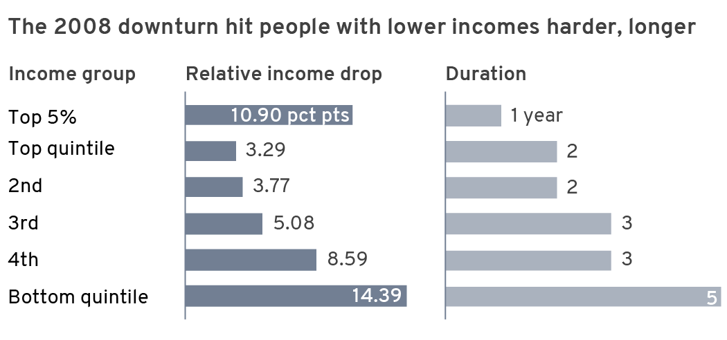
The 2008 downturn affected the quintiles very differently. The top 5%, top quintile and second highest quintile saw a dip in income levels in 2009 and 2010 but reached new peaks in 2011. The dip for the top 5% was 11 percentage points, compared to less than 4 points for the top and second highest quintiles.
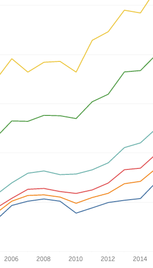
In contrast, the 3rd highest saw a dip of 5 points, the 4th almost 9 points and the bottom quintile dropped more than 14 points. The 3rd highest quintile didn’t surpass it’s 2008 level until 2012, the 4th barely did in 2012 and the 5th saw a relative drop of 15 percentage points and didn’t recover until 2014.
P ost 9-11 impact hit the wealthy hardest
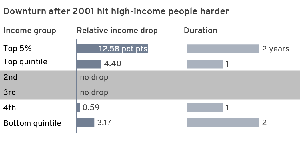
Unlike the 2008 aftermath, the wealthy groups saw the biggest impact in income after the 9-11 terrorist attacks. The top 5% dropped almost 13 percentage points in relative income and took two years to recover. The top quintile and bottom quintiles saw a quarter of that impact. The 2nd through 4th quintiles saw little or no downturn.
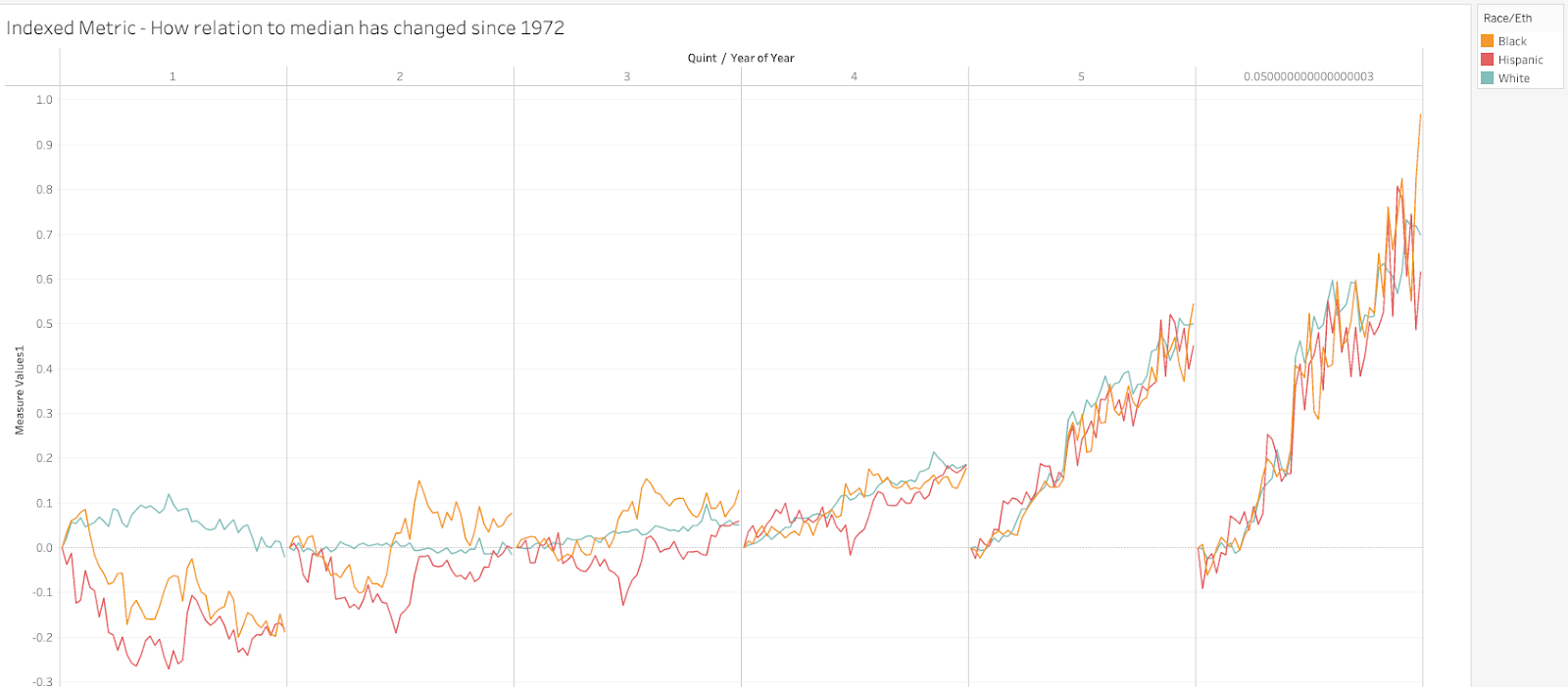
Deeper into the slope of the line – How the difference between each race/quint and the median has changed since an indexed point at 1972.
Data
Wealth data
Difference between ACS and CPS.
CPS uses less statistical methods but questions get into more detailed variety of income
“Because of its detailed questionnaire and its experienced interviewing staff, the Current Population Survey (CPS) Annual Social and Economic Supplement (ASEC) is a high quality source of information used to produce the official annual estimate of poverty, and estimates of a number of other socioeconomic and demographic characteristics, including income, health insurance coverage, school enrollment, marital status, and family structure.”
Metric Race Quints.csv
Non-inflated measure of percent of each race-quint household income (Race Quint Income) off of the median each year. As a ratio, it is not affected by inflation and should be compared to inflation-adjusted metrics.
Data relationships to explore:
- DJIA, straight
- DJIA, volatility
- Employment, overall
- Employment, volatility
- Employment, sectors
- Import/export ratios
- Industrial production
- Producer price index, industrial
- GDP, straight
- GDP, volatility
- Worker vs CEO ratio
- Union metrics
- Offshore repatriation https://www.federalreserve.gov/econres/notes/feds-notes/us-corporations-repatriation-of-offshore-profits-accessible-20180904.htm#fig2
- Troop deployment levels (incl contractors)
- FED bank rate
- Mortgage, T-Bill, etc
- Asset purchases, debt buying
- Schools of thought as data sources/metric
- Inflation rates
- Tax rates, nuanced
- Government spending levels
- Foreign transactions https://apps.bea.gov/iTable/iTable.cfm?reqid=19&step=2#reqid=19&step=2&isuri=1&1921=survey – 3 years
- New Home Sales
- Construction Spending
Measures affected by inflation:
- SNAP benefits
- GDP B
- Producer price index Total manufacturing
- DJIA year close
- Imports
- Net exports
- Exports
- Fed expend non-produced net asset
- CPI less food and energy
- Federal expenditures
- Fed defense spending
Current set starts at 1970 for most comparisons. Race quints start at 1980 now becuase of white category, should be updated if possible to 1970 and all to 2019 or 2020 as available.
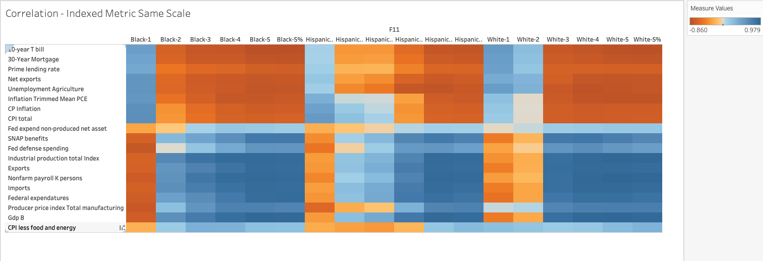
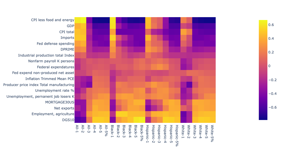
First pass at correlations (rough, non-inflation adjusted, etc.):
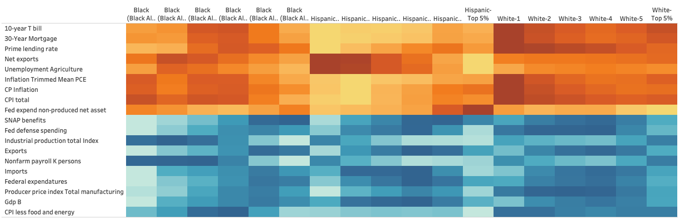
Adjusted inflation factors adjusted, with further expanded slope-of-line using index of percent off median … In other words how each group has changed in their relative relationship to median since 1972, same scale across all rows:
Python, plotly view:

Volatility, year-over-year percent change in metrics:
Volatility, absolute value of year-over-year percent change in metrics:
Volatility, measured by percent change between min and max WITHIN a year (daily, weekly, monthly or quarterly measures)
Removing time-dependant variance
The high levels of correlation (>90%) among MOST of the data leads to the consideration of a time-dependent effect that year over year is larger than the control for inflation. For instance, the inflation-adjusted value of GDP has still increased 3x since 1972.
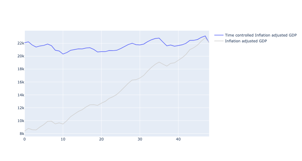
To get a better handle on the correlations here I used a time-controlled metric – flattening the increases over time to find correlations beyond time. These lead to correlations that are a more valid place to look for connections between wealth gaps and other metrics. This step is taken with a measure of caution … it’s possible that these over time increases are driving the wealth gap more than the factors that show up when time is controlled. For instance, the 3x increase in GDP could be part of the basis or connected to a wider wealth gap and that controlling for it finds other, potentially less significant, correlations.
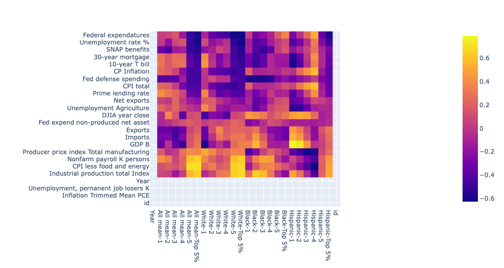
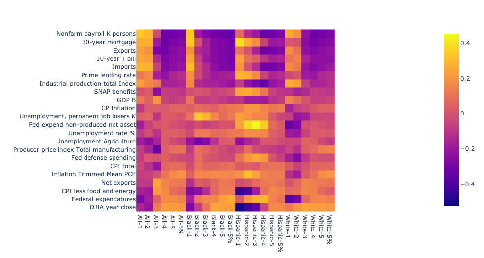
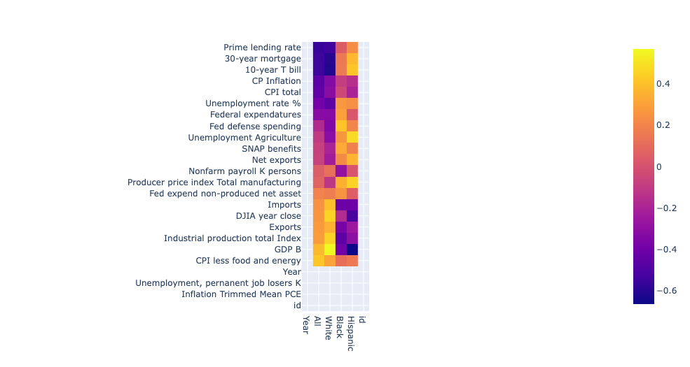
The resulting correlation matrix has correlation values that are more expected of actual variance, maxing out in the 60% range with lots of <1% values. Another interesting facet emerges that shows large differences between the correlation effects based on race (it’s important to remember that quints are not absolute across races: The 4th lowest white quint makes more than the 4th lowest Black quint). This difference can be better visualized as line charts among each race. Keep in mind these are correlation values, not some series that you would normally expect with a line chart, but in this case, the line helps weigh the shape of the correlations based on quints for each race.
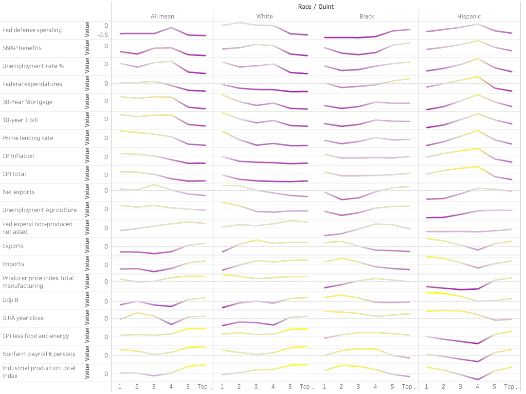
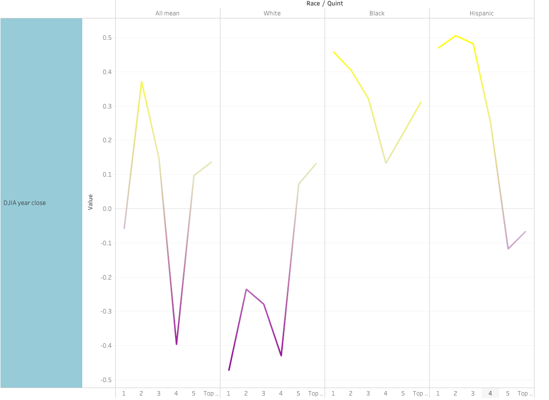
In this view it’s clear that some of the correlation facets are REVERSED based on race. Increases in the DJIA have a negative effect on lower – and mid-income whites and positive for upper income whites. That effect is flipped for Hispanics, while Blacks show a positive relationship between income and the DJIA across ALL quints, highest among the lower.
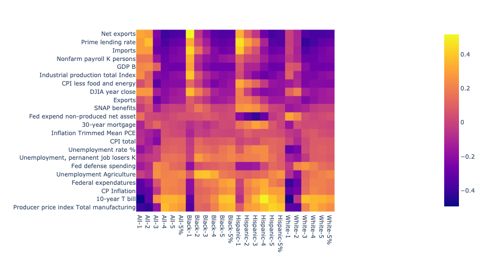
The difference between races is perhaps more starkly seen when we measure the gap between the highest and lowest quintiles:
This measurement comes with another caveat that likely helps explain the starker contrasts between races. Unlike the previous measurements that were based off a difference between quint income and total median income, this is a measure of the gap between top and bottom and therefore is untethered to other races. A reasonable potential effect is that changes to certain facets have a strong positive effect on the top white quint, increasing the white gap and at the same time a stronger positive effect on the lower Black and Hispanic quints, decreasing those gaps – or vise versa.
The shapes from the correlation line charts can help find connections between the data. The 30-year mortgage rate and 10-year treasury bond are known to move in tandem because they share the same marketplace. The correlation lines of those two facets mimic each other:
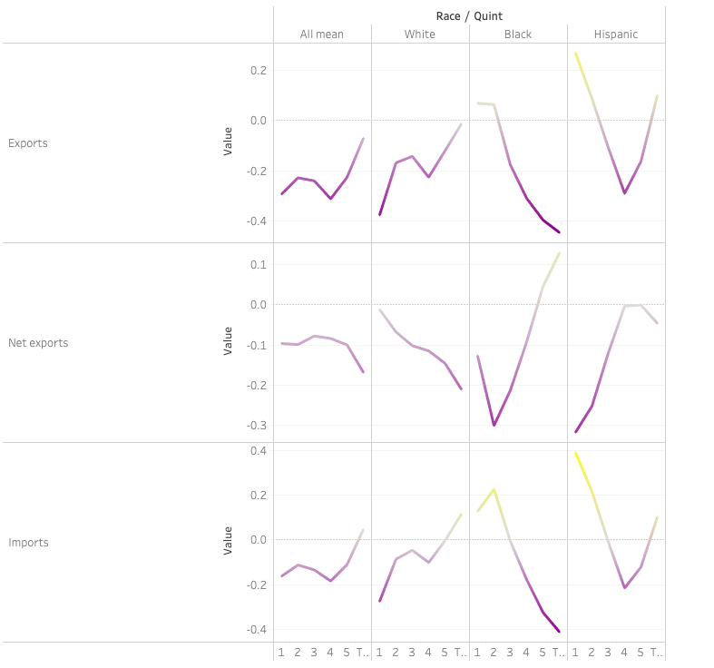
The lines can find other, less intuitive connections, such as the tie between imports and exports, which would be expected to both be affected by changes to topline GDP, etc. (contrary to the recent focus on the ballance between those two):

Indeed, looking at the trade balance of net exports, we see that higher net exports actually is associated with LOWER income for mid- and upper-income whites, with opposite effects for Blacks and Hispanics.

Here we evaluate a basic premise in the data so far: Using a normalizing metric across all race/quints, we have so far evaluated the income of that race/quint in relation to the median of all, which can be sensitive to changes in the median. To get a view of absolute income effects in each race/quint, I reran the analysis using straight, inflation adjusted income amounts rather than a ratio to the median. The resulting correlation shapes are very similar, but the lines have shifted on the Y-axis, in other words, some positive correlations are negative while previously negative relationships are more so, for some facets. Shapes for import/export without consideration of median income relationship:
While decreasing the differences between extremes/ flattening the variance between race/quints, this metric gives a truer view of positive/negative relationships between facets and race/quint income.
The full chart:
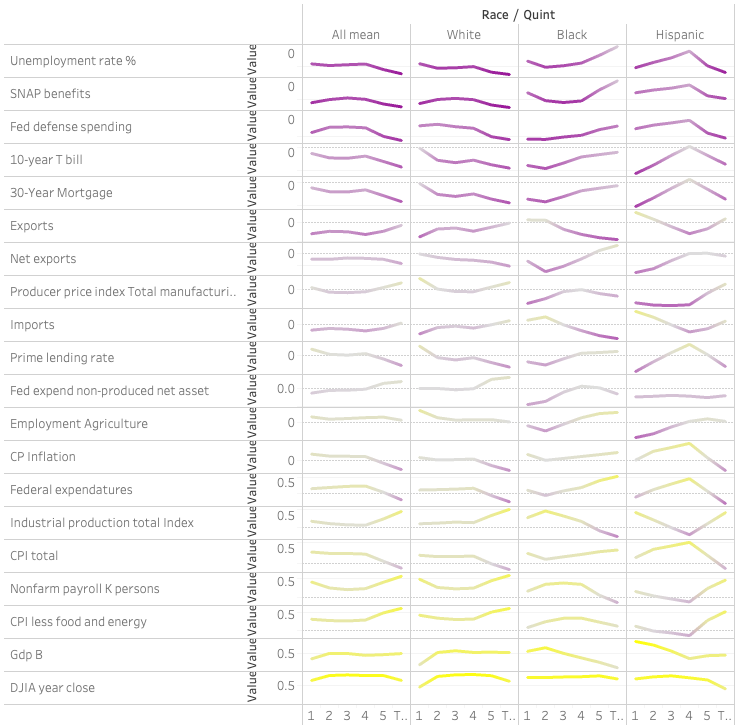
Many of the values here are related to the same story: the strength of the economy. Three basic measures of the economy – Industrial production, GDP and the DJIA provide insight at differences between race/quints. While overall positives in each of these have positive effects on peoples’ income as a whole, there are some deep counter-intuitive effects for certain race/quints:
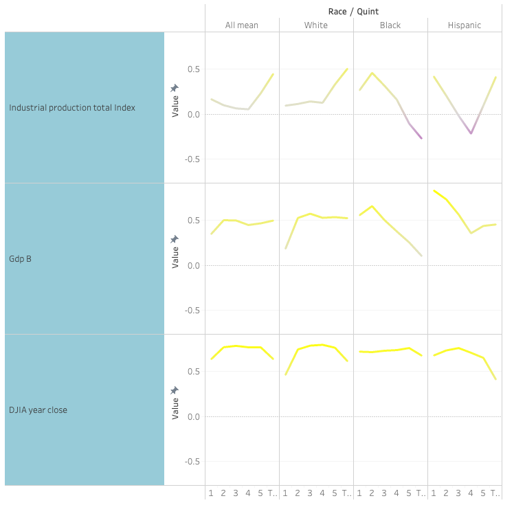
More production and higher GDP, is related to lower positive and even negative effects for the Black 4th and top quintiles. Another mystery, which could be some deeper-seated issue within the data, is that the 4th Hispanic quintile is often an outlier to the rest of Hispanics. That this aberration is reflected to a lesser degree in the 3rd and 5th quintiles weighs in on the side that this is a real effect. Either way it bears further analysis.
Next:
- Evaluate strongest effects and other aspects line by line
- Look at race differences in Voli using time controlled inflation numbers and not off median metric. (Volatility is dependent on magnitude of baseline (or is it %?)).