What is Context Journalism?

Correlation Identifies Patterns of Inequity across Government, Industry and Citizen Interests

By Bennet Harvey

ReNews envisions a new experience of news media with the craft of journalism at its core, enhanced with unlimited contextual information to allow each Citizen to fully understand how news and policy will affect their personal best interests.

ReNews also introduces a new education-based Citizen experience of news based on the process of identifying societal issues and developing policies to address them.  This process it the same for:

    1. Legislators, lobbyists and policy experts working to develop the next generation of public policym
    2. Journalists covering the issue areas, policy development process, and holding politicians and vested interests accountable, and
    3. Citizens exploring the issues that impact them and their families, following the policy development process, determining their personal policy positions, voting or influencing their legislators, and holding the powerful accountable for outcomes and unintended consequences of policy.
  1.  

At Renews we have developed a new journalist role of News Navigator to help Citizens to:

    1. understand this public policy process, 
    2. use data to determine which issues and policies affect them, and which vested interests are aligned with or against their personal best interests, and
    3. Engage with public policy development to ensure their personal objectives are considered.

Public Policy Engagement Process

The diagram below documents the process underlying the ReNews experience of news and civic engagement.  It’s the same process used in the legislative, journalistic, and Citizen processes of engagement with the American democratic process.

This process is also how ReNews Navigators identify issue areas and policy spaces into which ReNews will commission original Context Journalism reporting.  The remainder of this page shares some examples of our R&D process to define this new branch of the craft of journalism.

The ReNews Issue Discovery and Policy Development workflow applies to how the Context Engine is experienced by journalists, Citizens, academics and analysts.

Social Justice Heat Map - WORK IN PROGRESS

Correlation Identifies Patterns of Inequity across Government, Industry and Citizen Interests

By Bennet Harvey

To determine how changes in the overall economy affect Citizen best interests ReNews built a massive database of Citizen and societal information going as far back as 1929.  Using this data, we are able to compare trends in key government and economic data with income and other outcomes for segments of Citizens by income quintiles, race, level of education, and household composition.

This correlation analysis allows us to measure the extent to which government, Industry, and corporate and industry policies benefit or harm specific groups of Citizens.

Insights from Correlation

Positive correlations mean that when a societal data variable like Gross Domestic Product (GDP) goes up, a Citizen variable is statistically likely to also go up.  Negative correlation indicates that when one variable goes up, the other is very likely to go does.  Correlation near zero mean one variable never moves consistently with the other variable.

When considering GDP, the growth of the overall economy and individual industries, we would expect all Citizens to benefit from growth and all Citizens to be negatively impacted by recession in the size of the economy.  

This expectation is based on the fact that growth of the economy has always been associated with increases in other economic measures which directly benefit Citizens, including the economic variables highlighted in green below.  Later we cross-reference these economic variables with Citizen spending by cateogry, and inflation data for the same spending categories.

Economic Variables

  • Employment Agriculture
  • Nonfarm payroll K persons
  • Industrial production total
  • Index Prime lending rate
  • 30-Year Mortgage
  • 10-year T bill
  • Inflation Trimmed Mean PCE
  • CP Inflation
  • CPI total
  • Gdp B
  • Producer price index Total manufact..
  • DJIA year close
  • Imports
  • Net exports
  • Exports
  • Fed expend non-produced net asset
  • CPI less food and energy
  • Federal expenditures
  • Fed defense spending


CE Spending &. CPI Inflation Variables

  • ALCBEVG
  • APPAREL
  • EDUCATN
  • ENTRTAIN
  • FOODTOTL
  • HEALTH
  • HHFURNSH
  • HHOPER
  • HKPGSUPP
  • MISC
  • PERSCARE
  • READING
  • TOBACCO
  • TRANS
  • UTIL 

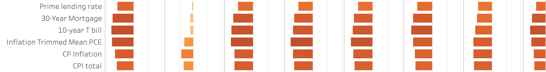
The following image shows one cell in a correlation matrix at the intersection of GDP B and Citizen Education spending.  Note that when GDP B rises, Spending on high school and masters degrees increases, while spending on associate and bachelors’ degrees declines. 

Note in the following correlation cell of Producer Price Index against Education Spending there a similar relationship, but shifted to the left, or more negative for each level of education.

This third correlation cell shows Agriculture Employment against Education Spending with exactly the opposite relationships at each level of Education.

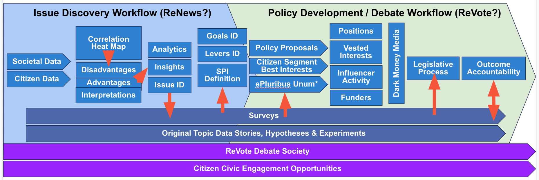
The ReNews team is in the process of examining a list of such patterns across society in order to :

    1. Evaluate whether each pattern is beneficial or harmful across American communities.
    2. Identify whether there is opportunity to magnify positive forces, or counteract harmful ones. 
    3. Commission original Context Journalism to cover the causes and human impacts of the most damaging patterns.
    4. Document and monitor policy proposals in each domain, and the vested interests supporting or opposing each proposal.
    5. Record patterns of Citizen support and opposition across their deep but anonymous ReNews belief profiles, and help Citizens determine whether their beliefs align with their best interests.
    6. Map media campaigns attempting to influence Citizens in one direction or another, and the vested interests and budgets behind the campaigns.

This is only one example of the methods ReNews Context Journalism applies to identify and cover patterns within societal performance which might indicate inequity or policy opportunity.

Increases in some of these primary measures are often accompanied by increases in secondary variables.  For instance, when Employment increases beyond a level near full employment, the competition between companies to hire employees results in competition in wages.  This in turn leads to increases in average wages across higher growth industries, and sometimes the entire economy.  In other cases, industry demand exceeds supply of qualified Citizens coming out of the education system motivating policies to support immigration and foreign workers.

The ReNews Context Engine and non-linear experience of news allows Citizens to explore the complexity of these relationships at their own pace, and according to their own interests.  There is no algorithm because there are no ads and no subscriptions to motivate an algorithm.

Levels of Correlation

There are three ranges of correlation visible in these heat maps:

    1. Highly positive correlations – relationships with correlations at or near +1.0.  In these cases both variables consistently move in the same direction, up or down, together.
    2. Highly negative correlations – relationships with correlations at or near -1.0.  In these cases both variables consistently move in opposite directions, up or down, from each other.
    3. Middle range correlations – relationships with correlations between +0.67 and -0.67.  In these cases the variables move less consistently, whether in the same direction or opposing directions or not at all.
      1. From 0 to +0.25 and from 0 to -0.25 there is very little consistency in movement.
      2. From +0.25 to +0.67 and from -0.25 to -0.67 there is moderate consistency in movement which Renews will explore in more detail.

Cross-correlations Expose the Obvious

Cross-correlations of economic variables against each other reveals which variables are consistently aligned, opposed, or influenced by other factors.

Some of the strong positive and negative cross-correlations which appear logical include:

  • Correlation of GDP growth with employment growth.
  • Reduction in manufacturing production correlates with increased importation of durable goods.
  • Increased inflation negatively correlates with discretionary purchasing but is not significantly correlated with essentials.

While these are not new insights, ReNews believes that statistical validation of core truths can go a long way toward anchoring all Citizens in a common set of agreed-upon societal information.  That, in turn, can lead to better collaboration in the policy development process.

Unexpected Correlations

Sometimes Renews’ multi-variable correlation analysis or ‘correlation mining’ turns up unexpected relationships which are not intuitive.  In these cases, we let our news and data analysts apply higher level math to dig deeper into the meanings of these relationships in the ReNews hypergraph.

For example, the apparel and miscellaneous categories of personal expenditures are less directly correlated to increases in positive economic indicators than other categories and in some cases are negatively correlated.

Apparel’s negative correlation with bad economic news, column 2, shows much weaker correlation than other spending categories. Citizens keep buying clothes in bad times.

We select these observations for further investigation because they differ significantly from the correlations in other categories.  We plan to consider likely inflection points we should see in the data, like:

  1. the emergence of “Fast Fashion” and
  2. changes in overall apparel average price due to increased secondhand sales and rentals via the internet. 

Citizen Profile Correlations

When ReNews earns the trust of a sufficient number of Citizens, we will be able to analyze the population of anonymized Citizen belief profiles for:

  • correlations of their profile data with their policy positions. 
  • the demographic and belief mix within clusters of Citizens aligned with or against a position.
  •  correlation of cluster membership with societal and economic data. 
  • correlation of policies with Citizen outcomes to reveal patterns of Citizen best interests to guide future policy development.  

When ReNews reaches this threshold of membership it will suddenly become more valuable than consumer surveys, which have been rapidly declining in reliability since the advent of cell phones.

It would be difficult to architect a better means of engaging reliably with Citizens about their beliefs than in a

  1. completely transparent news and contextual information platform,
  2. in which each Citizen feels protected by perfect anonymity.

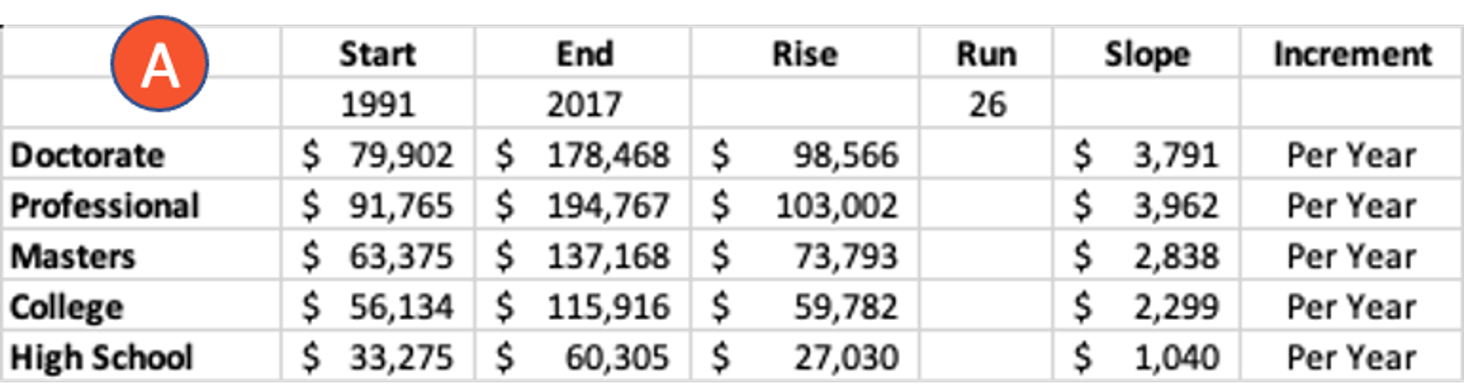
Regression Measures a Mix of Correlations

Once we determine which separate variables are correlated with a Citizen outcome, ReNews is able to look one level deeper to see which of the correlated variables explain more or less of the change in Citizen income.  To do this we apply regression analysis.  Instead of looking for correlation between two variables, regression analysis looks for a mixture of correlations between several input variables and a single output variable.  The result shows the percentage that each input variable contributes to determining a change in the output variable, Citizen income in this case.

Employment & Income - WORK IN PROGRESS

What is Income and How is It Different Than Wealth?

By Bennet Harvey

Most of us get our wages and tips in a paycheck, and some of us take income from our investments in the form of capital gains, dividends, interest and other highly regulated financial mechanisms.  All of these are considered types of income reported by the Bureau of Labor Statistics, the Securities and Exchange Commission, and the Census Bureau of the Commerce Department.  

Income of all kinds is reported on a person’s, company’s or country’s Financial Income Statement and their tax returns, and determines both how much is spent and saved each period, and how much makes the transition into long term wealth, or debt.  

In their ReNews Anonymous Profile each Citizen may build a simple picture of their income, expenses and savings over time.  This allows ReNews to mathematically calculate the:

  • issues that affect the Citizen, 
  • policies in the Citizen’s best interests, and
  • Influences trying to change the Citizen’s mind. 

Wealth is the collection of careful savings from income, usually over long periods of time. 

There are two kinds of wealth:

    1. Invested Wealth
    2. Inactive Wealth (not invested)

The first puts wealth at risk in exchange for opportunity for returns, or income.  The second preserves wealth at no risk, but forfeits the opportunity to earn income.

The difference between people with wealth and those without wealth is the additional income and potential additional wealth building made possible by invested wealth.  This factor may explain most of the reason upper income people are accelerating away from lower income people – the amount of in\vested wealth they possess, and the ever-increasing amount of additional income that provides, above wages.

Renews will perform considerable analytics to explore the extent to which invested wealth explains the increasing gap between the top quintile and top 5% relative to the remainder of US Citizens. 

Shift of Income and Wealth to the Top Quintile and Top 5%

By Bennet Harvey

Since 1967 the total income earned in the American economy has multiplied by 22, from $497 billion to $11 trillion. 

In the same time, the proportion of total income received by the top 20% of Citizens increased from 43.6% to 51.5%.  That is nearly an 8 percentage point nominal difference, but is an increase of over 18% in the proportion the top earners have received compared to 1967.

It gets more extreme at the very top.  In the same time period the share of total income taken home by the very top 5% of earners, the top quarter of the top quintile, increased from 17.2% to 22.3%.  This is an increase of 29.7% in their share of total income compared to 1967, by far the largest income increase to any segment of society.  

The 29.7% increase in income earned by the top 5% of households accounts for 64.6% of the increased income to the top quintile, top 1/5, or top 20% of households.  This means that the top 5% or top 1/20 of earners took home 9.8% more income than the remaining three quarters of the top quintile over the time period.

The question for society is:  

What proportion of individual economic success is due to individual merit and effort, and what percentage has its foundation in the efforts, advancements, and innovations of other individuals and generations?

Context Journalism was created to explore data like this and the questions it raises.  When ReNews hypergraph analytics identify issue areas, we document them today, and backwards in time to understand their sources.

Once issue areas become clear, we ask hard questions about whether the situation is justifiable, desirable, reversible, and negotiable.  We ask academics, policy experts, vested interests, and anyone qualified by their experience and expertise.  We don’t spend much time on politics beyond measuring its spending.

Data Insights:  

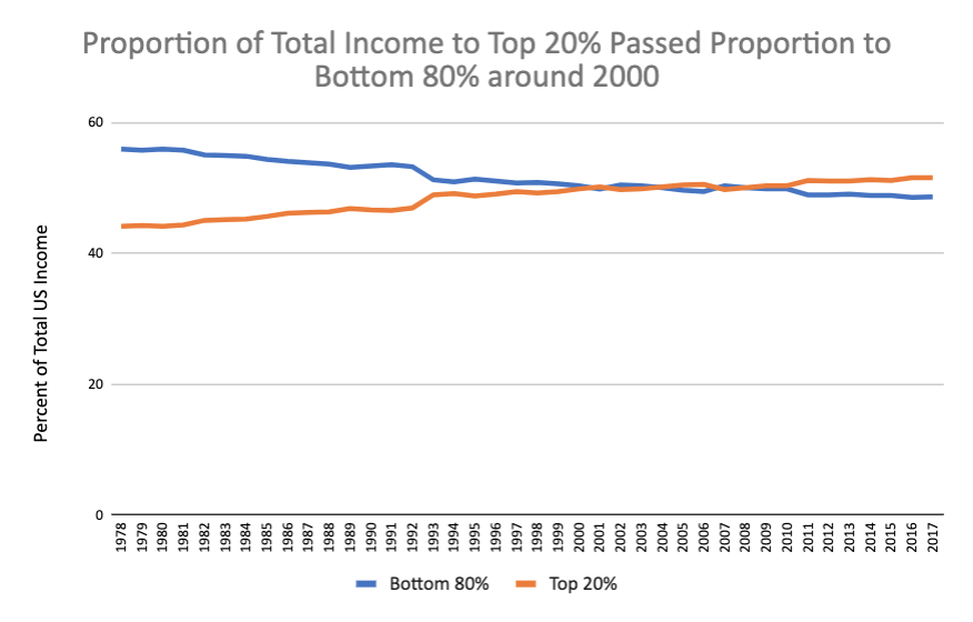
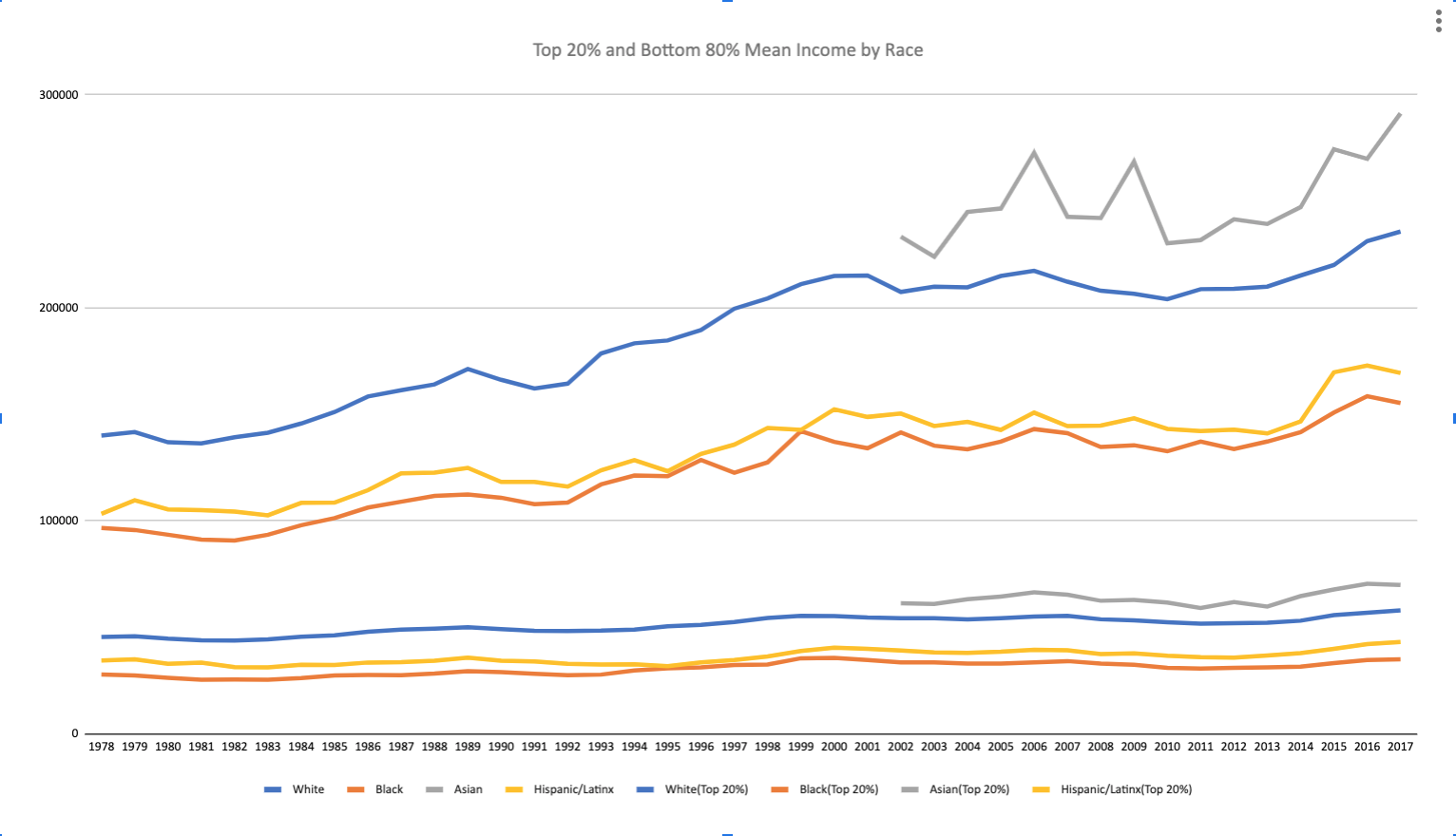
  1. The share of total income to the top 20% of citizens has consistently increased over the past 50 years, while the shares of income to the other four quintiles has consistently declined over the same period.
  2. The charts below compare the proportions of Total Income to each quintile as well as to the top 5% at the beginning of the data set (1967) and the end (2017).
  3. The majority of the increase in income (65%) to the top quintile has gone to the top 5%.
  4. The top quintile now receives 51.5% of income to US households.

An interesting threshold was crossed around the turn of the century when the proportion of total income earned by US Citizens in the top 20% passed the proportion of total income earned by the bottom 80%. 

Percent of total income earned by top 20% and bottom 80% of Citizens.

Read More

Since 1967 the gap between the upper quintile and the lower income four quintiles has grown nearly 20%.
Proportions of total income earned by Citizen income quintiles.

Income Shift by Race Seen across the Board, in Top 20%, and in Bottom 60%

By Bennet Harvey

As far back as the data goes, race inequity has been clearly represented in US income data.  The graph at right shows a remarkable pattern that is evident across all quintiles, and is almost identical for the top quintile / 20% of Citizens (represented in the upper cluster of four lines in the adjacent graph) as it is for the bottom 80% of Citizens (represented in the lower cluster of lines in the adjacent graph).

Asians consistently receive more income than White Citizens, then there is a large gap after which Hispanic and then Black Citizens earn much lower incomes as groups than Asians and Whites.

What does this mean?  Here are a few considerations:

    1. Income includes both wages and investment income, so this pattern can’t be attributed to one or the other alone.
      1. ReNews will apply regression analysis to understand the mix of contribution from these factors.
    2. It is likely that investment income explains the larger portion of the gap between Asians and Whites, and the much lower incomes of Hispanics and Blacks.
      1. ReNews will conduct historical analysis to try and etermine when these relative income proportions were established.
    3. The gap between Asians and Whites is much larger than between Hispanics and Blacks.  ReNews will examine whether this is due to:
      1. greater invested wealth among all Asians
      2. a particular Asian subgroup with remarkably higher invested wealth.
      3. A particular Asian subgroup with remarkably higher base wages.
      4. Whether this gap can be explained by policy impacts such as H1B visas.
Top 20% of Citizens by race (above) and bottom 80% of Citizens by race (below)

Proportionality and Empathy

By Bennet Harvey

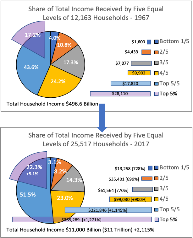
For any Citizen to understand what this has meant for other Citizens, we must consider the changing proportions of the rewards from the growth of our economy across segments society.

The table below illustrates the relativity of each quintile plus the top 5% to every other quintile. 

This reveals some interesting observations:

  1. At the extremes
    1. The average of the top 5% of earners received 29 times the income of the average of the bottom 20%.  
    2. From the bottom quintile perspective, the average earner in the bottom 20% earns only 3% of the income of the average of the top 5%.
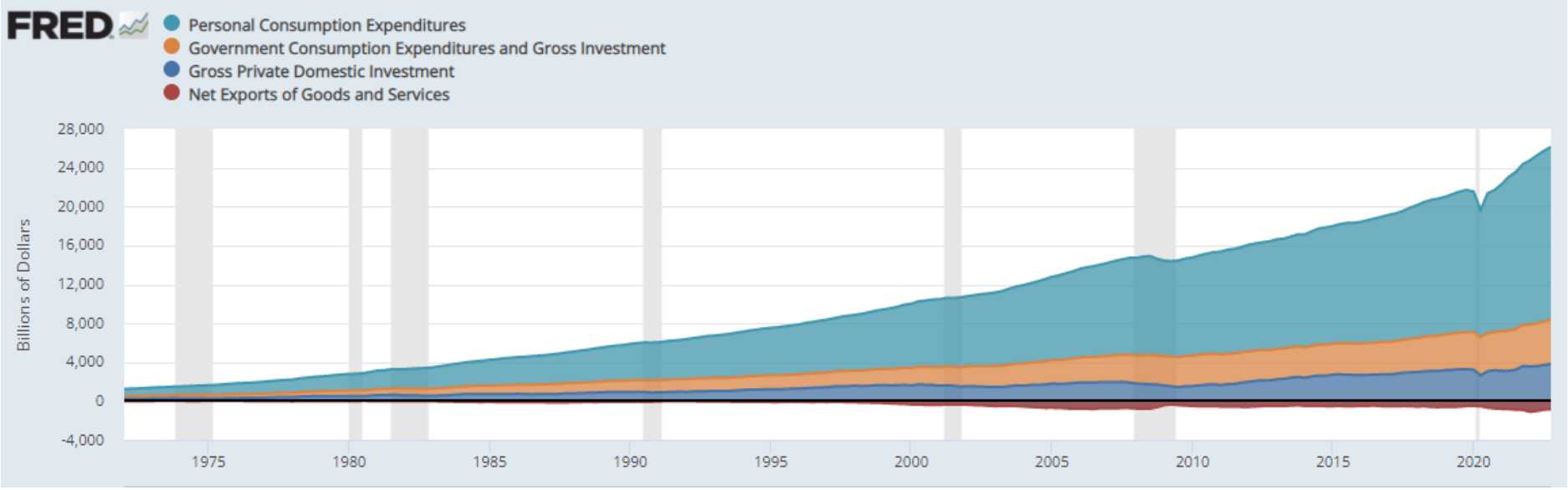
2. In terms of moving up the economic scale,

    1. the average household in the bottom quintile of income earns just 37% of the second quintile.
    2. the average household in the second quintile of income earns just 58% of the third quintile.
    3. the average household in the third quintile of income earns just 62% of the fourth quintile.
    4. the average household in the fourth quintile of income earns just 45% of the fifth quintile.
    5. the average household in the fifth quintile of income earns just 58% of the top 5%.
    6. This means that at every level an average household must roughly double their income to reach the average of the next quintile.

Data Insights

  1. Those with only a high school education are being left behind $1260 more each year.
  2. The rate of increase in value is fastest for the Professional Degree at $3,962, which means it is leaving the others behind.
  3. Each increment in number of years of schooling receives higher income, and increases at a higher rate per year, except Doctorate.

A. The Doctorate degree earns less than a Professional degree, and is falling behind by $171 per year. 

As we explore this region of data, an experimentation plan might look something like the following.
Since 1967 the gap between the upper quintile and the lower income four quintiles has grown nearly 20%.
Slope = "Rise" / "Run", or Money / Time.

Industry & Economy - WORK IN PROGRESS

The Industry & Economy Topic

By John Beahm and Bennet Harvey

ReNews’ Context Journalism coverage of the Industry & Economy topic will tackle a number of big contextual questions:

  1. How do industries and the economy impact Citizens as consumers, investors and employees of those industries?
  2. What are the major industry sectors?
  3. How do sectors differ in their roles in the US economy?
  4. How have different industries been impacted by the historical boom and bust business cycle?
  5. What is the difference between industry and economy?
  6. How does government regulation affect industries?
  7. How does government regulation affect the overall economy?
  8. What have been the major policy approaches to managing the intersection of industry and economy?
  9. Who has direct and indirect influence over regulatory and economic policy?
  10. The ReNews hypergraph data environment is designed to support analytics to answer these and many more questions. 

Our approach is to work our way downard into greater detail as we go, documenting key observations, insights, and hypotheses for how to optimize outcomes across the American economy.

Financial Metrics and Analytics Drive ReNews Measures of Performance and Influence across American Industry

By Maria Kieslich and John Beahm

Finance is just math plus rules for how you can use math within financial laws and regulations.  Every entity participating in an economy must organize their finances in roughly the same way.  Whether a Citizen’s personal finances, corporate finance, or government budgeting, the financial performance of every participant in the economy is measured with fundamentally the same documents: 

  • Income Statement
  • Balance Sheet
  • Statement of Cash Flows
  • Tax Returns

GDP is a measure of the overall performance of the economy and individual industries.  The international Monetary Fund (IMF) defines GDP as:

GDP measures the monetary value of final goods and services—that is, those that are bought by the final user—produced in a country in a given period of time (say a quarter or a year). It counts all of the output generated within the borders of a country.

GDP helps ReNews understand the magnitude of industries and companies and their relative influence within the US economy.  We use other financial measures to similarly rate the influence of influencers and their messaging strategies on public opinion and public policy.

Maintaining Dynamic Economic Equity

Most accounting laws and regulations apply equally across all entities in the economy, but not every regulation is identical for all industries or companies.  

Sometimes these differences are structural, due to the inherent way the industry operates.  Many industry sectors are subject to exceptional tax laws, subsidies, regulations and regulatory costs due to factors including:

  • the economic model in which they operate, 
  • the extent to which they impact public resources, 
  • their use of public infrastructure, and
  • the risks they pose to America’s Citizens, environment, and other community interests.

However as administrations change within our two-party system, sometimes political forces influence these regulations to intentionally benefit or harm some sector, ostensibly for well-promoted motivations.  Changes made to regulations under one administration may or may not be reversed by subsequent opposing party administrations.

Over time this process has resulted in an extremely complex web of regulations and tax codes.  Each adjustment to favor a subset of an industry or the economy creates inequity, as well as unintended consequences.  Often these adjustments become conventions which can last for generations before their wisdom is challenged in the context of new economic circumstances.

A problem has always been how to design these laws and regulations to achieve society’s goals, without damaging some Citizens with unintended consequences.

Societal Performance Indicators (SPI)

It is clear that according to several key metrics, what ReNews calls Societal Performance Indicators (SPI), America is not doing well today in managing its finances and the best interests of its Citizens.

  1. Budget deficits
  2. National debt
  3. Environmental disasters
  4. Economic inequity
  5. Homelessness
  6. Healthcare costs and access
  7. Food insecurity
  8. Trust in institutions
  9. Infrastructure maintenance
  10. Degradation of the middle class
  11. Social-economic divisions
  12. Economic and racial bias in law enforcement & incarceration

ReNews is developing a new set of measures of these and other societal dysfunctions.  We propose to combine these measures with traditional financial statements and SPIs for every participant the economy so Citizens may track society’s progress in one trustworthy place.  

The Renews Context Engine will present Citizen-readers with the impact of these measure on society, on segments, and on each individual Citizen.

Financially-Derived Measures of Influence

By Bennet Harvey

Since the advent of social media, we have measured influence by things like followers, likes, clicks, and streams.  These measures have no relation to the inherent value of the information being viewed, or the entities presenting the content.

ReNews will replace social media measures of influence with a transparent financially-based framework to measure and rank the influence of entities within the US economy, and within news media and political ads, including:

  • Industry GDP Contribution
    • Companies
      • Executives
  • Government Budgets
    • Branches
      • Departments
      • Agencies
      • Political appointees
      • Civil Servants
  • Vested Interest Influence Spending
    • Industries
    • Policies & Regulations
    • Influencers
    • Media Budgets
  • Policy Expert and Data Influence
    • Topics
    • Issue Areas
    • Data reference integrity
    • Policies & Positions
    • Media budget-equivalent exposure

Instead of using an algorithm to prioritize content on the basis of what will sell ads, ReNews will empower Citizen-members to control their navigation throughout a trustworthy data environment as they explore the context of messaging they receive in their news feed.  

The calculations behind these measures of influence will be transparent, and will enable navigation tools to support Citizen-members of ReNews to move through the ReNews app learning experience, each following their own non-linear path.

Controls include:

  • Focus:  Topic
  • Scope:  Jurisdiction Level from City to Federal
  • Date:  All, Range, Timeline View
  • Media:  Articles, Academic Studies, Data Sets, Vested Interests, Influencers. 

Gross Domestic Product (GDP) Designed to Track America's Industrial Portfolio

By Maria Kieslich and John Beahm

GDP is a key variable in the ReNews societal dashboard.  A well-diversified economy performs like a well-diversified investment portfolio.  The economy’s overall performance is hedged against declines in one sector’s success metrics by the probability that other sectors will improve, or new sectors will emerge to replace ones at the end of their lifecycle.

The Spending View of GDP

Looking at GDP, you can see the dynamism of an economy as society’s portfolio of industries grows and evolves.  For instance, the composition of the US economy has changed meaningfully in the last 50 years.

The spending view of GDP, showing Personal Consumption, Government Consumption, Gross Private Investment, and Net Exports (negative).

In this view we see the growth of the economy from 1947 to today, as well as the proportions of Personal Consumption, Government Consumption, Gross Private Domestic Investment, and Net Exports (negative).

An interactive version of this chart will show a few points:

    1. Consumers are in the driver’s seat; what and how much people buy determines the course of the economy.
    2. Government has consistently been shrinking as a proportion since 1991, from 21% to 16.8% in 2022.
    3. Before 1991 Government’s proportion was virtually flat aroun 21% back to 1950.
    4. Government expenditures are high in wartime and low in peace.
    5. In recession and depression personal expenditures are higher, and personal investment is low.

The Production View

Another way of looking at GDP is land, labor and capital that companies added as they produced things to be bought.

At the highest level, GDP is split into goods, services and government services.
The visualization below shows how these three industry groups have contributed to the economy over time. 
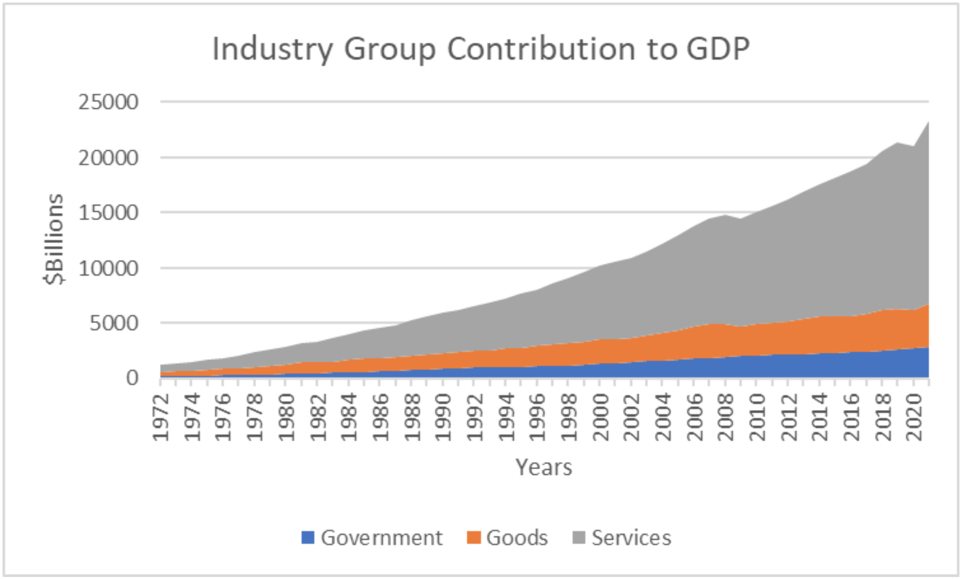
Industry Group Contribution to GDP shows a somewhat different picture than the spending view. across Government, Goods and Services.

A few observations:

  1. Even though they represent large ticket items, goods like cars and MRI machines, are not the main driver of the economy.
  2. Service providers, such as lawyers, carpenters and hairdressers are a greater influence.
  3. Over time services have become even more important. Note that in the early 70s, services were around 52% of the economy, while goods were 31% and government made up the rest around 17%.

Services Versus Goods and Government

Move forward more than a generation to the turn of the millennium and Services had grown to over 65%, while Goods as a contributor the economic activity had fallen almost 10% and Government had dropped to about 13%.  By the end of 2021, Government still hovered around 12%.

Agility in Policy Development

By Bennet Harvey

Society is no longer sufficiently agile in its ability to respond to circumstances which are changing at a continuously accelerating pace.

Ultimately, our economy and society are at existential risk due to the inability to dynamically respond to upcoming disruptions.  This particularly includes the imminent emergence of machine learning and artificial intelligence systems which will explode the ratio of untrustworthy information to trustworthy information in the world. 

ReNews proposes its Context Engine, and Policy Engagement Process as societal tools to support greater agility in responding to a chaotic world.  

ReNews also proposes that any such platform and system must be operated by the old school craft of journalism measured with new Citizen tools of bias transparency, to correct for financially-driven campaigns of influence.

Any such platform must be overseen by a new generation of governance model to ensure platform transparency, and which facilitates but does not define coverage decisions.

ReNews also believes that such a system must support transparency into societal function at all jurisdiction levels, and therefore must support new coverage of local government ooperations, as well as county, congressional district, state and federal levels.

Industry GDP Contribution over Time

GDP data is also broken out by industry in several levels of detail.  These proportions have also shifted over time reflecting the changing nature of the American economy.

We can see how major technological, financial, policy and demographic changes have shaped which industries emerged, flourished or faded. Gaining this context could help Citizens make decisions about where to live, work, what type of education to get, or where to invest.

The “tree” diagrams below compare industry proportions of the total economy GDP from 1972 and from 2021.  The ReNews team has made several observations from this data:

    1. In 1972 the US was recovering from a quick and shallow recession. The economy still had many vestiges of what propelled economic growth in earlier decades: manufacturing and growth of middle class consumption.
    2. Manufacturing was the top industry both in terms of contribution to GDP at 22.3% and employment with over 19MM workers.
    3. The most important industries after Manufacturing were Finance and Retail, both service industries.
    4. Fast forward. Past the 1980s when the first computers were showing up in peoples homes and japanese cars were a common sight in garages. Into the new millennium, where the first wave of tech companies are booming, busting and rebuilding. When cavalier finance led us to the Great Financial Crisis.
    5. Landing in 2021. The composition of the economy is markedly changed due to technological advances spurred by the Apollo program and defense spending, and the rise of the US healthcare, education and financial hubs.
    6. Consequently, Manufacturing, although still important because it employs people all over the country, literally contributes only half as much to the economy as it did 50 years ago.
    7. Retail is also less important, not because the consumer demand has lessened, indeed more people work in retail than they did in 1972, but because other industries have grown so much, particularly other service industries.
      1. Financial services, (which includes all the people who deal with the money the economy generates from your real estate agent to a Wall Street investment banker) has been a constant top contributor to the economy over time, even during the Great Financial Crisis.
      2. Professional Services, comprising everything from accountants and consultants to software engineers, has been the biggest engine of growth over the last few decades. Rising to be the second largest industry in the US in terms of GDP and employing over 30MM people, the most of any sector.
      3. Of note is also the Healthcare industry, another service industry that relies on technology and education. It moved up the most over the last two generations, to be the 5th most significant industry to our economy in terms of production.

State GDP Contribution 

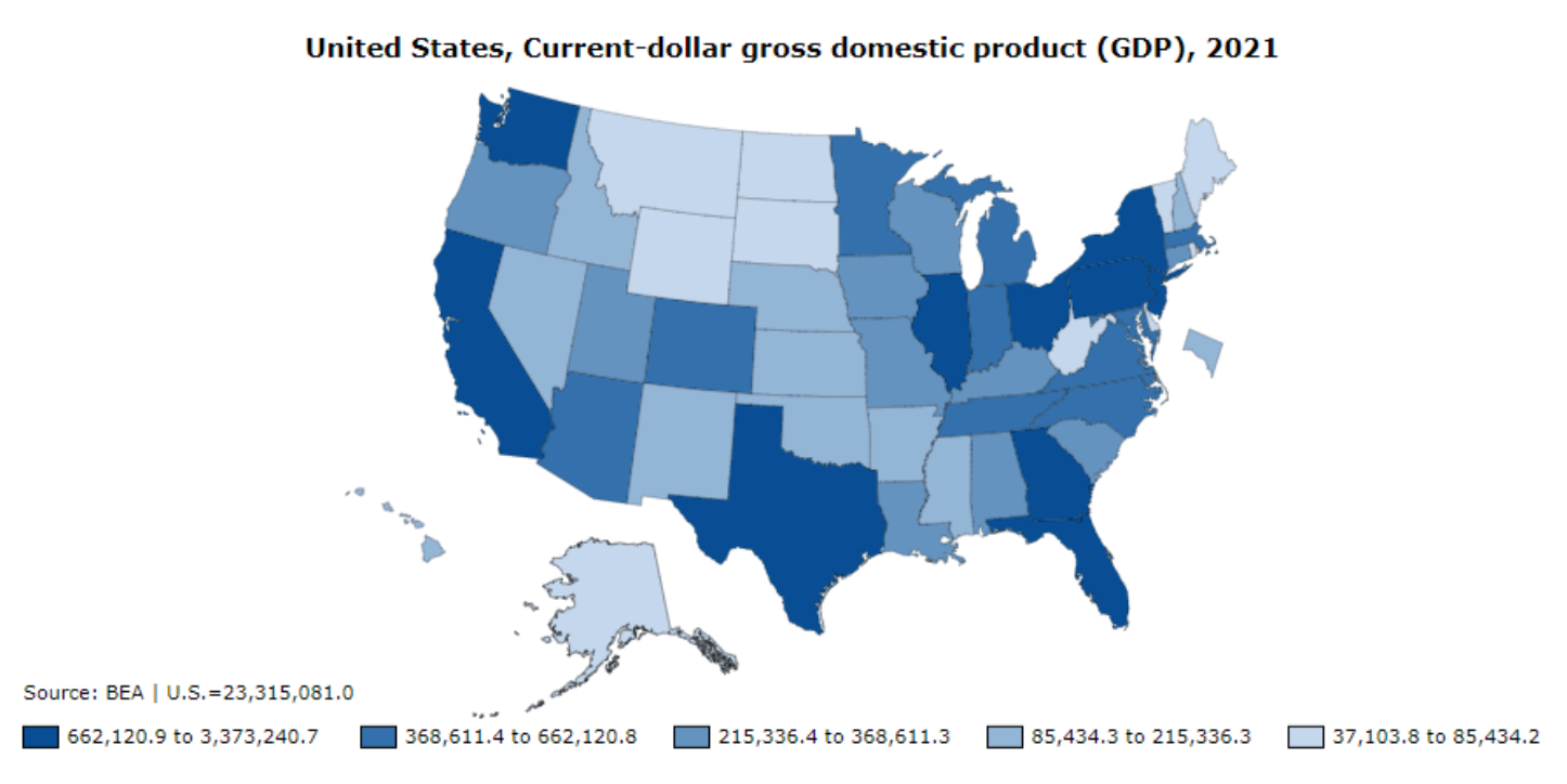
Another view of GDP is  the individual state contribution. The chart below shows which states are the economic engines of our economy. 

[Make a point here about top contributors accounting for X about of the total. Perhaps compare that if California (or the other top one) were its own country, it would rank X in the country ranks.]

Looking at GDP this way, individuals can see how your state mix of industry influences its policy decisions.  These priorities further define how your state’s concerns and relative influence might be weighted in the national policy discussions. 

The map below shows the relative contribution of each state to overall US GDP.

Relative state contributions to overall US GDP.


State Employment 

Comparing the map above to the tree diagram below allows us to see the alignment of Texas, or any other state’s, employment with GDP production.

Texas employment by industry, 2021
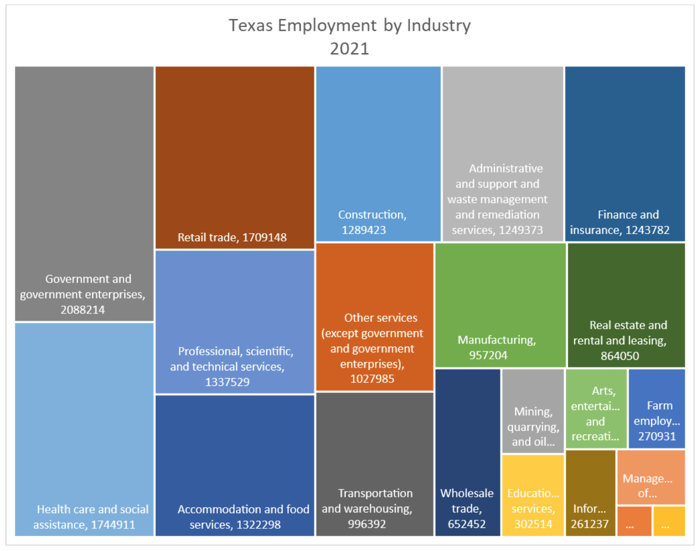
  1. Note that the Oil & Gas industry, Mining, Quarrying and Oil…, is a much smaller portion of the state’s employment than many Citizens assume.

Conclusion

Looking at GDP in different ways gives us three insights.

    1. When we see the trends of certain industries over time, it can inform career decisions.
    2. Questions can be answered such as which college major or training to obtain, or whether to switch industries/careers. Investors use this information to pick industry and specific company winners.
    3. Lastly, an examination of GDP provides insights into which states, which industries, which corporations will have influence on policy decisions at the national and local levels.

Education - WORK IN PROGRESS

Education is the Pathway to Greater Income

The data below confirms long-held understanding that more education consistently leads to higher income.  This is true at all levels of education, except for doctorate degrees, which actually reduce income relative to a masters degree. 

The data doesn’t show why this is true, but we have identified a couple of hypotheses worth testing:

    1. The value of a Masters of Business Administration (MBA) in terms of resulting income has been much higher than the value of many other Masters and PhD degrees.  Therefore, the MBA may have inflated the overall value of a Masters degree above that for an overall PhD.  This could be tested by removing the MBA from the Masters data set and running the analysis again.
    2. The MBA is, by definition, training to take a leadership role in industry and finance.  Therefore, it is possible that the income value of an MBA may be skewed by the fact that more people with MBAs are in a position to influence their own pay, than people with advanced degrees in the humanities, medicine or other fields.  Does this reflect inequity in our system?

Hypothesis 1  

The MBA may have inflated the overall value of a Masters degree above that for an overall PhD.

Experiment:  

Remove the MBA from the master data set and run the analysis again.

Conclusion:  

TBD

Assumptions:  

HS=12, College=16, Masters=18, Professional=19, Doctorate=20+ 

Hypothesis 2 

The income value of an MBA significantly exceeds the value of other masters and PhD degrees, leading the the overweighting seen in Hypothesis 1.

Experiment:  

Analyze the value of an MBA compared to other advanced degrees, and weight by the frequency various degrees are earned.

Conclusion:  

TBD

Assumptions:  

HS=12, College=16, Masters=18, Professional=19, Doctorate=20+